NHTSA
logotype
There are four standard versions of the NHTSA logo - a horizontal logo with and without the tag, and a vertical logo with and without the tag.
- When the horizontal logo is used smaller than 3” in width, the underline and tag is eliminated, and the logo without the tag should be used.
- When the vertical logo is used smaller than 1.25” in height, the underline and tag is eliminated.
- Do not color, rotate, skew, or apply effects to the logo.
1-Color variations should be from 100% to no less than 5.1 contrast ratio as shown. *1-color variations should adhere to clear space and size requirements.

Icon Set
The standalone icon is reserved for NHTSA use only, not to appear as introduction for the NHTSA brand. The one-color standalone icon set should ONLY be used in very small spaces to retain legibility.
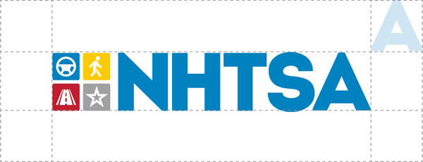
Clear Space
The minimum clear space around the logo must be equal to the height/width of the “A” in NHTSA at the respective size. The logo is not to be hindered by surrounding elements.
1-Color variations should be from 100% to no less than 5.1 contrast ratio as shown. 1-color variations should adhere to clear space and size requirements
